Some Good News, But a Terrible Graphic
 George Soros has given $18 billion to The Open Society Foundations, his grant-giving organizations. A spokesperson for the group said the transfer "reflects an ongoing process of asset transfer that has been underway for several years." She also said that Soros, "plans to leave the vast majority of his wealth to the Open Society foundations." His fortune is estimated at more than $26 billion.
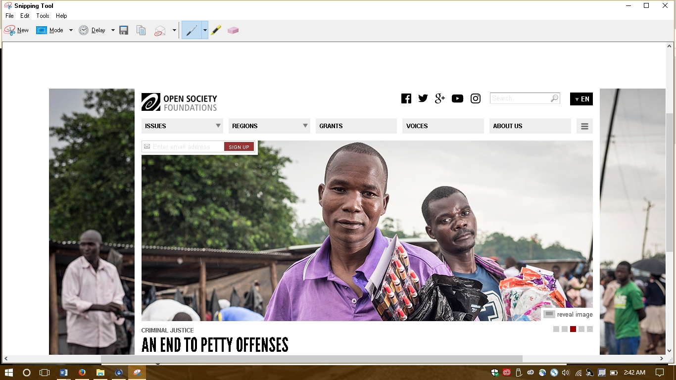
The 87-year-old Hungarian has been criticized for aiding refugees and influencing local politics. On the website, The Open Society Foundations identify the mission and vision, including this first statement:
The Open Society Foundations work to build vibrant and tolerant societies whose governments are accountable and open to the participation of all people.
The website also shows this graphic for expenditures.
Discussion:
- Should the organization say more about the money transfer? I don't see a statement on the website. Why do you think the spokesperson didn't provide a more extensive statement?
- I say the chart is "terrible." Do you agree? Why or why not? Which principles of visual communication are followed, and which are lacking?
