
Controversy About CEO Pay Disclosure
The U.S. Securities and Exchange Commission voted to require CEOs to disclose how their pay compares to that of employees in their organization. The requirement is part of the Dodd-Frank Act, passed in 2010 to prevent another financial crisis and to protect consumers.

The decision is one strategy for what people consider pay inequity between high- and low-earners in the United States, which has increased dramatically, as reported by BloombergBusiness:
"Average CEO pay at the 350 largest U.S. companies by revenue surged 997 percent from 1978 to 2014, while the compensation of non-supervisory employees rose 10.9 percent, according to the Economic Policy Institute, a research group that advocates for workers.
"While CEOs earned about 30 times what the typical employee did in 1978, corporate chiefs' pay had jumped to more than 300 times their employees' compensation as of 2014, the institute said."
Opponents say the ruling creates an expensive process and will serve only to embarrass CEOs. But the decision offers several ways for companies to calculate wages, excludes up to 5% of foreign workers, and requires reporting only every three years.
Discussion Starters:
- What's your view of the ruling? Is this the right move, and will it achieve its purpose?
- How do you assess the Economic Policy data shown above? What story do the numbers tell, and what may be missing?
- How could you display the Economic Policy Institute data visually? What chart type(s) would be most appropriate?
Political Polls and Charts
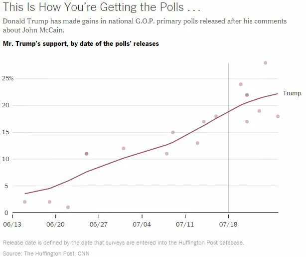
Ah, politics and polling. The media loves to report every data point, but now we have an example of a misleading poll. People have been surprised that Donald Trump, Republican presidential candidate, hasn't taken more of a hit after his comment about Senator John McCain. Trump said, "He's a war hero because he was captured. I like people that weren't captured, OK?"
A New York Times article explains why Trump may still lead the Republican polls, although people are upset by the remark. One explanation is that poll reporting lags. We hear the results of polls days after they're taken. In the chart below, the article shows the results of Huffington Post and CNN polls as we saw them in the news, showing Trump's comments on July 18.

This second chart shows the results of polls the date they were taken:

Discussion Starters:
- How much do you think poll matter during an elective? How, if at all, do they influence you?
- What can be done to ensure that polls don't mislead the public? Consider the roles and responsibilities of news agencies.
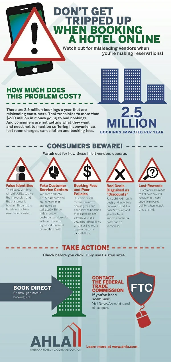
Users Get Duped by Hotel Booking Sites
 Last week, I wrote about the false report that Bloomberg is acquiring Twitter. This week's news is about people believing they book a hotel online, but the reservation is through a fake site.
According to the American Hotel & Lodging Association (AH&LA), 2.5 million bookings-$220 million-are going to rogue sites. Users who book through these sites may find that they don't have a reservation when they get to a hotel, they may be charged large fees, or they may get misinformation about rates or cancellation policies.
The Better Business Bureau suggests that people double check URLs, don't believe logos (which are easily copied), and avoid deals that are "too good to be true."
An LA Times article reminds us to look for secure signs on a website when entering personal information such as a name for a reservation or a credit card number: "You'll know you are connected by https if you see a lock in the URL bar of your Web browser."
Image source from the AH&LA.
Discussion Starters:
- What other advice would you have for people to assess whether a website is valid? Use the principles in Chapter 9 and your own ideas.
- Do you think a hotel has any responsibility for these rogue sites? Why or why not?
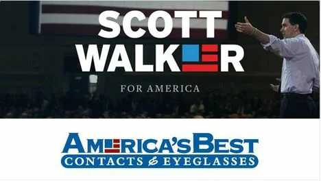
Scott Walker's Logo Controversy
Presidential candidate Scott Walker revealed a new logo, but critics say it's too close to that of America's Best Contacts & Eyeglasses.

The company has commented on the similarity, particularly to point out that it is not endorsing Scott Walker. According to NPR, CEO Reade Fahs also said Walker has probably seen the logo: "It's on hundreds of stores across the country. So assuming he's got good vision, he probably would have spotted it in his campaign travels. And we have lots of stores in Wisconsin too." Fahs said the controversy is "sure good for our business." He said, "Ever since the controversy erupted our online eye exam bookings have hit record levels."
A Walker spokesperson told NPR, "There are thousands and thousands of people who use the American flag as branding." She may be right, and logos are often called into question for similarities. Hillary Clinton was criticized for hers when she announced her campaign in April.
Discussion Starters:
- What's your view of the similarity? Should the Walker campaign have known better?
- What should Walker do at this point? Should the governor find a new logo?
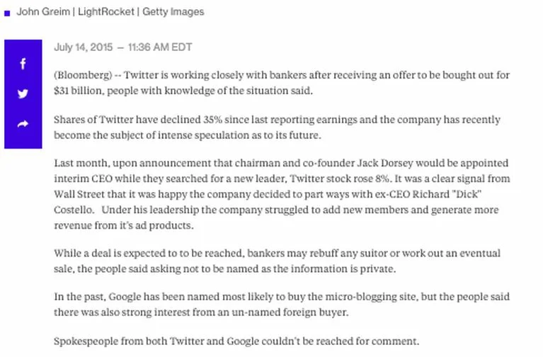
People Duped by Twitter Story
A fake story that Bloomberg is buying Twitter sent shares up 8.5% at one point. The news came from the website bloomberg.market-not the real bloomberg.com-with the title "Twitter attracts suitors." The report claimed Bloomberg would acquire Twitter for $31 billion.
According to a Reuters article, experts say the "fake website and report did not require a high level of skill." Anyone can register a website. What's surprising is that people believed the news so readily. Former CEO Dick Costolo's name was misspelled as Costelo in the article.

Although Twitter and the SEC didn't comment on the story, Bloomberg Ty Trippet representative offered a brief statement: "The story was fake and appeared on a bogus website that was not affiliated with Bloomberg."
Discussion Starters:
- What principles of evaluating sources from Chapter 9 would have helped readers assess the story?
- Should Twitter have made a statement about the story? Why or why not? If so, what should the company have said?
- What are the ethical considerations in this story? Who got hurt?
FIFA Official Cites The Onion
One of the executives charged in the FIFA corruption case is defending himself with an article from The Onion, a satirical newspaper.
In a video claiming his innocence, Jack Warner, a former vice president of the soccer organization, points to the article, "FIFA Frantically Announces 2015 Summer World Cup In United States. Global Soccer Tournament To Kick Off In America Later This Afternoon."
NPR posted the full video, which was edited for Warner's website, as the author says, "presumably after much online hilarity."
Discussion Starters:
- In Chapter 9 of the book, we talk about the difficulty of distinguishing credible information on the web. I guess this applies to printed papers too? Should Warner have known better? What indicates that The Onion is a satirical paper?
- Watch Warner's video. Do you find his argument credible otherwise? What parts are most and least convincing?
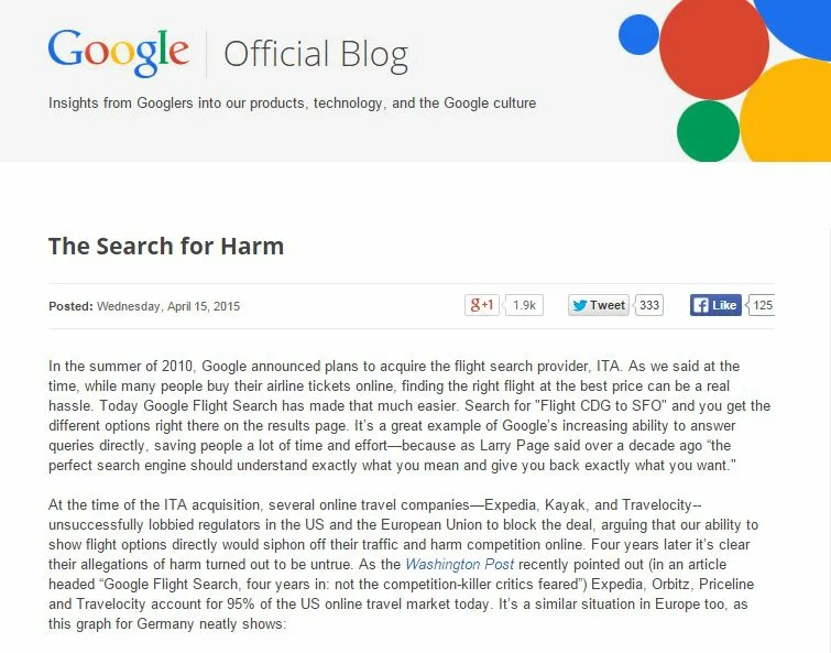
Google Responds to Antitrust Charges
In a data-filled blog post, Google's senior vice president of search responds to antitrust allegations. The first formal charge comes from the European Union, which claims that the company's own results are favored during searches. According to EU competition commissioner, "If the investigation confirmed our concerns, Google would have to face the legal consequences and change the way it does business in Europe."
In his response for Google, Amit Singhal includes evidence to the contrary. Google's argument is that its own results fair far worse than other sites' results in a user's search.

Within the post, Singhal offer four charts, including this about German travel sites, as evidence:

Discussion Starters:
- Read Google's entire post. Which arguments do you find most and least convincing?
- How could Singhal have improved his visual displays of data?
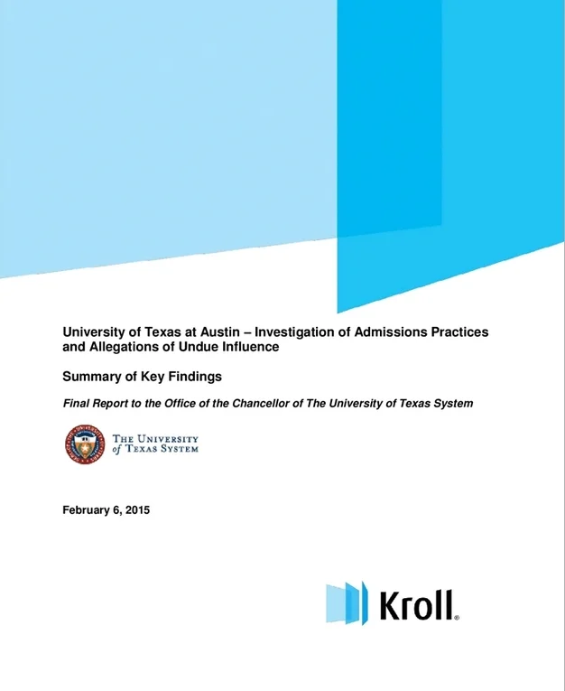
Reports on UT Admissions Process
 University of Texas at Austin President Bill Powers is being criticized for admitting students based on their political or financial connections rather than on their merit. An investigation found that Powers overruled admissions advice for at least 73 students.
Kroll, a risk-management firm, produced a 107-page report to the chancellor of The University of Texas System, identifying "tensions between the Admissions Office and the President's Office." To explain his decisions, Powers said, "They are in the best interest-long-term interest-of the university."
A July 2014 report from the UT System, "Best Practices in Admissions Processes for Undergraduate and Professional Programs," acknowledges the "suspicion of a double standard that favors well-connected students." The report identifies the following strategies to ensure a fair admissions process:
- Ensure transparency throughout the admissions process.
- Identify for students the criteria used in holistic review.
- Promote consistency in holistic reviews.
- Uphold the integrity of the admissions process by eliminating external influences and conflicts of interest.
Discussion Starters:
- What are your views about Powers' selection process?
- Imagine that you're one of the 73 or so students who was admitted, presumably, with lower grades and fewer qualifications than other students. How would this news make you feel?
- Read both reports: Kroll and the UT-System. Compare the organization, design, content, tone, and so on according to principles in Chapter 10. How could both reports be improved?
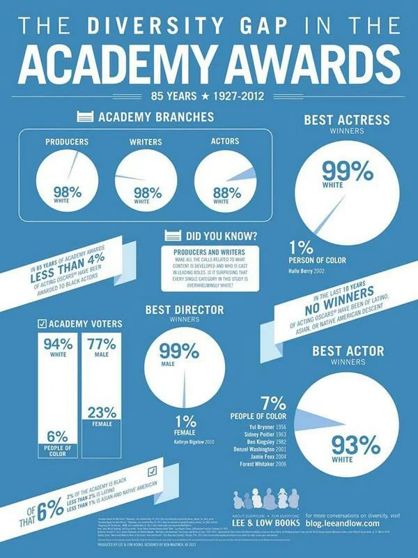
Oscar Diversity Problem? "Not at All"
The Academy Awards are under fire for lacking diversity in nominations this year. Although "Selma," the film about Martin Luther King, was nominated for best picture, its director and lead actor were snubbed. Criticism looms partly because all 20 nominees for best actor and supporting actor are white. "Selma," a highly acclaimed film received only one other nomination: best song.
Cheryl Boone Isaacs, the Academy's first black president, said, "Not at all. Not at all," when asked whether the organization had a "problem with recognizing diversity." She also told Vulture
"Well, it's a terrific motion picture, and that we can never and should not take away from it, the fact that it is a terrific motion picture. There are a lot of terrific motion pictures, it's a very competitive time, and there's a lot of great work that has been done. I am very happy that Selma is included in our eight terrific motioncture [nominations]."
"The good news is that the wealth of talent is there, and it's being discussed, and it's helpful so much for talent-whether in front of the camera or behind the camera-to have this recognition, to have this period of time where there is a lot of publicity, a lot of chitter-chatter."
Isaacs also told Time, "I would love to see and look forward to see a greater cultural diversity among all our nominees in all of our categories."
An infographic and the Twitter hashtag #OscarsSoWhite give us more perspective on the controversy:

Discussion Starters:
- Do you agree with the criticism?
- Analyze Isaacs statements. What works well to convey the Academy's position, and what could be improved?
- Here's another graphic showing concern about the Academy's lack of diversity. Which do you find more effective in conveying the message?
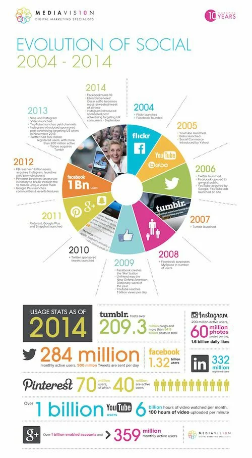
Social Media Infographic
The Evolution of Social Media infographic by Digital Marketing Agency MediaVision is getting some play. As a good infographic should, this one tells a story by combining text and graphics at-a-glance.

This reminds me of one of my favorite (early) infographics of all time, The Conversation Prism. Brian Solis has been updating this summary of sites and tools since 2008. Now in its four rendition, the infographic puts "You" in the middle of social media.

Discussion Starters:
- Which principles for creating infographics discussed in Chapter 9 do these two graphics follow?
- Compare the first version of the Conversation Prism to the current one. What has changed?
- What, if anything, surprises you about the Evolution infographic choices?
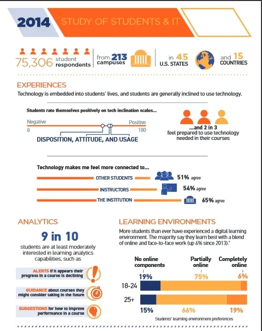
Educause's Technology Research
 Educause Center for Analysis and Research (ECAR) has published its findings about students' use of technology. The survey instrument asked undergraduates about their experience with individual devices, school technologies, learning environments, and personal preferences. More than 75,000 students and 1,700 faculty members in 13 countries participated.
ECAR produced several resources to explain the findings:
Discussion Starters:
- Which of the three resources (report, infographic, and PPT) do you find most accessible? Easiest to understand? Most comprehensive? Best organized?
- Of the survey results, what do you find most and interesting? Most and least surprising?
- Analyze the report. Consider the audience, organization, writing style, graphics, and so on. What works well, and what could be improved?
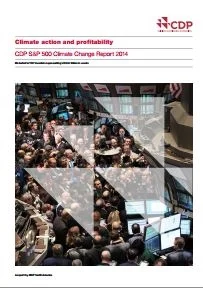
Climate Change Management Linked to Higher Performance
 A new report by CDP links climate change initiatives to higher corporate performance. The report starts with introductions by Hewlett Packard Chairman, President, and CEO Meg Whitman and CDP CEO Paul Simpson. HP has partnered with CDP, a non-profit organization that helps companies and cities measure, manage, and share information about environmental impact.
In the executive summary, the report highlights results of major corporations' initiaves to address climate change:
Our analysis shows that, on climate change management, S&P 500 industry leaders:
- generate superior profitability: ROE3 18% higher than low scoring peers and 67% higher than non-responders
- with more stability: 50% lower volatility of earnings over the past decade than low scoring peers
- grow dividends to shareholders: 21% stronger than low scoring peers
- exhibit value attributes attractive to equity investors
Although the results are impressive, the report warns that "correlation does not imply causation." Rather, the study authors conclude that top companies make climate change initiatives and communication a priority.
Discussion Starters:
- How is the report organized and formatted? Which principles from Chapter 10 are followed, and which are not?
- How readable do you find the report? Consider the audience and writing style throughout.
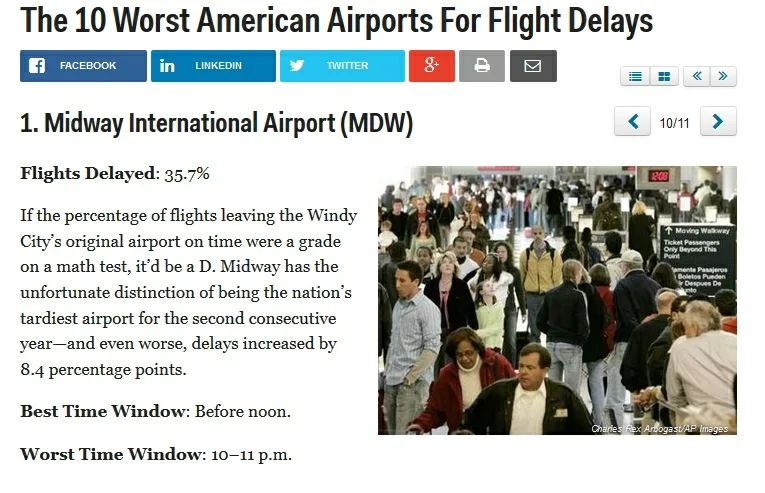
Worst Airports for Delays
A Business Insider article tells us at which airports we'll have the longest wait.

In a series of scrollable screens, the article shows the airports and their percentage wait time. A visual would help the reader see all information at-a-glance and easily compare airports.
Discussion Starters:
- What type of visual might work best for the data? Consider the audience and objective.
- Why doesn't Business Insider include a visual to complement the article? What's the value of having online readers scroll through the information?
- How can these airports improve their image? Of course, they need to reduce wait time! What else can they do from a communication perspective?
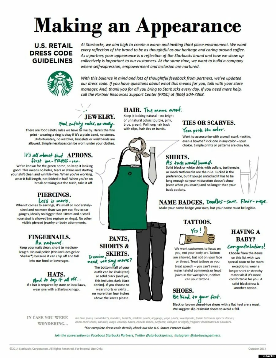
Starbucks Allows Tattoos
On Monday, Starbucks employees can wear their tattoos proudly-no more long-sleeve cover-ups. The decision comes after a barista amassed more than 25,000 signatures on a petition that describes her goal: "Change the dress code to allow visible tattoos. I believe tattoos are a simple form of self expression and as long as they aren't offensive or explicit, I think we should be able to show off our artwork proudly."
To explain its new dress code, Starbucks created this graphic:

The suggestions sound reasonable enough: "Keep your nails clean," "Pull long hair back," etc. I happen to be writing this at a Starbucks, and the employees look neat and clean. But I'm not counting their earrings or measuring their gauges.
Discussion Starters:
- What's your view of the tattoo policy? Was this the right decision? Why or why not?
- What, if anything, surprises you about the other dress code recommendations?
Vatican's New Tone About Gays
 In what sounds like a significant turnaround, Catholic bishops released a summary of their two-week meeting, including new acknowledgements of homosexuals:
Welcoming homosexual persons
50. Homosexuals have gifts and qualities to offer to the Christian community: are we capable of welcoming these people, guaranteeing to them a fraternal space in our communities? Often they wish to encounter a Church that offers them a welcoming home. Are our communities capable of providing that, accepting and valuing their sexual orientation, without compromising Catholic doctrine on the family and matrimony?
51. The question of homosexuality leads to a serious reflection on how to elaborate realistic paths of affective growth and human and evangelical maturity integrating the sexual dimension: it appears therefore as an important educative challenge. The Church furthermore affirms that unions between people of the same sex cannot be considered on the same footing as matrimony between man and woman. Nor is it acceptable that pressure be brought to bear on pastors or that international bodies make financial aid dependent on the introduction of regulations inspired by gender ideology.
52. Without denying the moral problems connected to homosexual unions it has to be noted that there are cases in which mutual aid to the point of sacrifice constitutes a precious support in the life of the partners. Furthermore, the Church pays special attention to the children who live with couples of the same sex, emphasizing that the needs and rights of the little ones must always be given priority.
According to Mashable, "Their report also reflected the views of ordinary Catholics who, in responses to Vatican questionnaires in the run-up to the synod, rejected church teaching on birth control and homosexuality as outdated and irrelevant."
However, a TIME article tempers excitement by explaining that the document says nothing binding: no new policy has been created as a result of the meeting. Still, the quasi-inclusive language is an encouraging shift.
Discussion Starters:
- Read the full report from the Vatican. What strikes you about the tone and messages?
- Is the news premature? Should gay rights supporters be happy about the news?
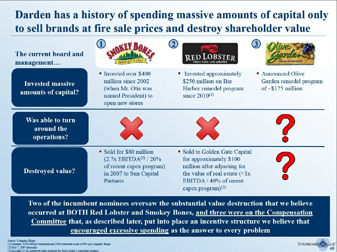
Darden Investor Creates 297-Page PPT Report
Starboard Value, a Darden investor, created an extensive PPT presentation to recommend ways to improve the struggling Olive Garden restaurants. Sales and stock prices have been falling.
Starboard, which owns eight percent of Darden's stock, criticizes Olive Garden harshly. The presentation uses clear, specific message titles, discussed in Chapter 10, and the word choices are direct.

The presentation is a good example of mixing text and graphics in a PowerPoint report.
Discussion Starters:
- Read the message titles across the report. Do you find a cohesive argument?
- Which pages work best, and which could be improved? Assess the balance of text and graphics and how clearly main points are conveyed.
- Assess the strong language. Is this appropriate for the audience? What are the possible consequences?
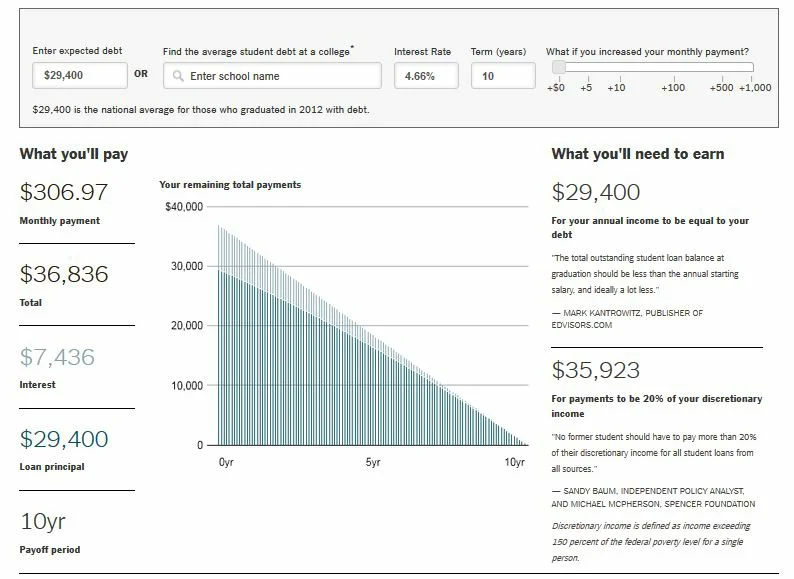
Graphical Student Loan Calculator
Embracing the value of interactive graphics, The New York Times created an online calculator for student loans. The results may be depressing, but the calculator tells students how much they will owe and what they need to earn to cover the expense. By filling in a few fields, students can see how interest rates, loan term (years), and additional monthly payments affect their principal and interest.

Using $29,400 as the average loan for a student graduating in 2012, we see that students need to earn that amount per year. Of course, more is better. At $35,923 per year, the loan repayment amount would equal about 20% of a student's discretionary income. (Of course, that may vary tremendously.)
Seeing the data graphically may help students get a clearer picture about what to expect-for better or worse.
Discussion Starters:
- Do you find the calculator easy to use? Is it useful?
- What other ways can you visual the data? Consider more creative graphics than this bar chart.
- What's your view of the recommended 20% of discretionary income for student loan repayments? In what ways could it vary based on geographical, health, personal, and other factors? Would this be a realistic number for you?
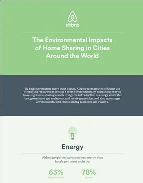
Airbnb Sells Sustainability
 In its latest advertising campaign, Airbnb is pushing its role in sustainability. Taking lessons from Chapters 5 and 7 in the textbook, Airbnb boasts saving the planet in concrete terms.
According to a recent report, published with the Cleantech Group, "In one year alone, Airbnb guests in North America saved the equivalent of 270 Olympic-sized pools of water while avoiding the greenhouse gas emissions equivalent to 33,000 cars on North American roads." The company also says that North American Airbnb guests use 63% less energy than do hotel guests, while European guests use 78% less.
The report results are summarized in an infographic on Airbnb's blog.
Discussion Starters:
- Read Airbnb's report summary. Which statistics make sense to you, and which are perhaps overstated or irrelevant?
- What do you think of Airbnb's marketing approach? Do you find it effective? Why or why not?
- Asses the company's infographic. What principles from Chapter 9 are followed effectively?
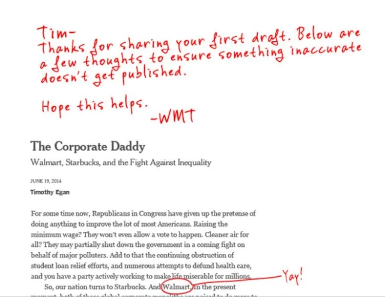
Walmart Edits New York Times Article
Walmart couldn't let a critical piece in The New York Times go unanswered. In an op-ed article, "The Corporate Daddy," Timothy Egan contrasts Walmart and Starbucks:
"As long as the Supreme Court says that corporations are citizens, they may as well act like them. Starbucks is trying to be dutiful - in its own prickly, often self-righteous, spin-heavy way - while Walmart is a net drain on taxpayers, forcing employees into public assistance with its poverty-wage structure."
 The impetus for the commentary seems to be Starbucks' recent announcement of tuition reimbursement for employees. Although Egan says, "It's a sad day when we have to look to corporations for education, health care, and basic ways to boost the middle class," he sees an opportunity for large employers-and criticizes Walmart for contributing in the wrong direction.
With tongue-in-cheek humor, Walmart posted an edited version of the article. The edits point to different sources and additional considerations for the value Walmart brings.
Discussion Starters:
- What's your view of Walmart's approach? Why do you think management took this approach? What alternatives would they have considered to refute the article?
- Assess evidence provided in the article and in Walmart's responses. In each case that Walmart disputes evidence, which argument do you find more believable?
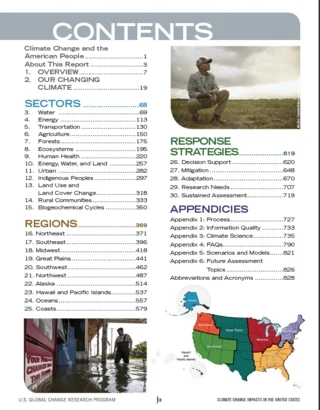
White House Climate Change Report
The U.S. Global Change Research Program just published a draft report, "Climate Change Impacts in the United States," which has gotten a lot of attention. The report blames human activity on climate change and warns of increasing erratic weather, damage to food supplies, and more warming conditions.
To help people understand the main points of the 829-page, 174 MG document, the authors provide a "Highlights" page on the Global Change website. But the highlights are still more than the average person will read.
 The website also offers an online version of the full report, organized around the following topics:
- Our Changing Climate
- Sectors
- Regions
- Response Strategies
The report is referred to as a draft version. Will the final be even longer?
In another attempt to help us understand the data, this Washington Post article highlights 15 graphics.
Discussion Starters:
- Does the length of the report matter? Who are the audiences, and how do you think each constituency would, if at all, read the report?
- What principles from Chapter 10, Writing the Report, does this report follow? Consider the organization, visuals, writing style, and so on.
- Compare this report to another recently published: "Not Alone: The First Report of the White House Task Force to Protect Students From Sexual Assault." What differences and similarities do you see, and what could account for them?