Audi Vehicle Shipments: Stacked Column

TempLast month, I wrote about creative charts posted by Business Insider. Today, the news website posted a traditional stacked column chart-an effective way to show parts of a whole.

Temp2The chart, at right, shows the estimated number of Audi vehicles declining slightly between 2017 and 2025. At the bottom of each column, we see gradually increasing numbers of semi- and fully autonomous vehicle shipments.

Of course, the chart isn't perfect. The numbers within each column would be easier to read with commas, and people who are color blind have trouble distinguishing between red and green, so they may not see clearly the difference between semi-autonomous and traditional vehicles.

But this chart is much better than an example I use in class from a Cornell Daily Sun article. The chart, recreated at left, uses stacked columns incorrectly and causes obvious problems in data comparisons. The red section labeled Asian American, 15.2%, is smaller than the red section labeled Native American, .5%. Intuitively, we know there are fewer Native American students on campus than Asian American, but the visual is skewed.

Discussion:

  • What are some other examples for which a stacked column chart would work well?
  • Recreate the chart at left. What would be a better way to display the data?
Read More

Is a Bad Wine Label a Turnoff?

Temp
Temp

Visuals matter, particularly for wine sales. I'm interested in the topic because friends just gave me a bottle labeled "Cow Tipping" for the fun name and graphic. But apparently not everyone agrees with this strategy for choosing wine.

In the past, wine labels have been traditional, featuring images of a chataeu, for example, but winemakers-and wine marketers-have gotten creative. Yet not all designs work well.

Bloomberg called out six bottles for "terrible labels." Zinfandels, the article says, are particularly vulnerable to off-beat labeling: Plungerhead Old Vine and Zombie Zin are two examples. Others have a creepy eye leering out at the consumer or a blindfolded prisoner. For many of these, the author suggests, "Don't serve it by candlelight on a first date."

The article also tells us what we already know: sometimes beautiful packaging has no correlation with price, quality, or taste.

Discussion:

  • To what extent does a wine label influence your decision to buy?
  • Go to a local wine store. What catches your eye? Do you notice any correlation between label design and price?
Read More

Creative Charts

Color chartBusiness Insider gathered up a few Apple charts they call "eye popping." Some are useful and well done, while others are pretty but confusing.

This first one, by Ishtyaq Habib, is beautiful but impossible to read at a normal size. Zoom in five or six times, and you can read that these are company representations. Color coding by industry is clever, but why aren't they grouped together? Profit as the internal circle and revenue external is also clever, but the scale is so small. I imagine this as a terrific poster.

Next is a Wall Street Journal line chart comparing Apple sales to other products. It's clear and easy to read.Chart

A WSJ stacked bar chart is also well done. As percentages of a whole, the chart shows the comparisons by year clearly. The title is cute-"slide of the pie"-but may not be appropriate for business audiences. Also the colors are pale and babyish. I'm not sure why these were chosen, and I wonder whether people who are color blind would have a problem distinguishing the pink and blue next to each other.

Discussion:

  • What do you think of these charts? Look at the Business Insider article for more. Analyze them against principles from Chapter 9.
  • How could the color bubble chart be improved? The concept is great; it's just unreadable.
Read More

United Announces New Policies

United actionUnited Airlines CEO Oscar Munoz has found some strength and a way out of the situation that angered so many around the world. The company admits that dragging a man off of a flight two weeks ago wasn't the best way to make room for four United employees.

The company has published "Changes We're Making" in an email to loyalty members, in videos, on its website, in a report, and in an interview with NBC News. The website statement begins as follows:

We are making changes to ensure that we always put customers first

By United Airlines

Earlier this month, we disappointed our customers and ourselves when a passenger was forcibly removed from one of our planes. We can never say we are sorry enough for what occurred, but we also know meaningful actions will speak louder than words.

We committed to take action as a result of this incident, and today marks the first step in changing how we fly, serve and respect our customers.

 In the email with the subject line, "Actions Speak Louder than Words," United summarized its most significant policy changes:

We will increase incentives for voluntary rebooking up to $10,000 and will be eliminating the red tape on permanently lost bags with a new "no-questions-asked" $1,500 reimbursement policy. We will also be rolling out a new app for our employees that will enable them to provide on-the-spot goodwill gestures in the form of miles, travel credit and other amenities when your experience with us misses the mark. 

The $10,000 offer for re-booking is particularly clever: it's a generous amount, and it's unlikely the airline will have to pay that much.

Meanwhile, the airline settled with Dr. Dao for an undisclosed amount. Good idea to end the nightmare. The last thing United needs is more publicity about the case.

Discussion:

  • How are they doing? Analyze the audience, communication objectives, content, and writing and presentation styles. Also consider the timing and policy changes.
  • Read the full report. Which principles of report writing are allowed, and what could be improved?
  • To what extent will these communications and policy changes affect United's image?
Read More

Snapchat Is 'Only for Rich People'?

Snap
Snap

In 2015, did Snapchat founder Evan Spiegel say the app is "only for rich people" and that he didn't "want to expand into poor countries like India and Spain"? That's the claim by a former employee who is suing Snap Inc. for wrongful termination. Anthony Pompliano alleges he was fired after accusing the senior leadership team of inflating app metrics before the IPO.

Snapchat poor
Snapchat poor

Pompliano says the company falsely advertised the number of daily active users (DAU), violated a non-solicitation and non-compete agreement, and exaggerated growth and retention data. Pompliano claims that Speigel's response about poor countries came when he suggested going into international markets to expand the user base.

A representative for Snap responded:

"This is ridiculous. Obviously, Snapchat is for everyone! It's available worldwide to download for free. Those words were written by a disgruntled former employee. We are grateful for our Snapchat community in India and around the world."

Snap doesn't deny data discrepancies, but says they aren't as significant as Pompliano claims. Pompliano contends that the discrepancies indicate "a wide-spread, systemic failure in Snapchat's internal controls over its user data." A Fortune article warns that questions about user registrations and engagement could be important to investors, who bought stock in what Fortune calls a "giant IPO" that "just proved we're in a tech bubble."

Discussion:

  • Let's assume Spiegel made those comments. Do you find them offensive, taken out of context, or something else?
  • How well did Snap handle the response?
  • How serious are Pompliano's claims? What effect, if any, do you think they might have on investors?
Read More

Wells Fargo Blames a Manager

Wells Fargo Traffic
Wells Fargo Traffic

An investigation led by Wells Fargo's board into the practices that led to thousands of false accounts blames Carrie Tolstedt, the former head of the retail division: 

The root cause of sales practice failures was the distortion of the Community Bank's sales culture and performance management system, which, when combined with aggressive sales management, created pressure on employees to sell unwanted or unneeded products to customers and, in some cases, to open unauthorized accounts.

The report also says the former CEO John Stumpf was "too slow" to investigate possible issues. The report is public on Wells Fargo's website.

Tolstedt's lawyers dispute the allegations. Stumpf once referred to Tolstedt as the "best banker in America." Reuters reported:

Tolstedt was perceived by high-level employees as having the support of Stumpf, with whom it was considered best to avoid raising problems with.

"Stumpf was ultimately responsible for enterprise risk management at Wells Fargo, but was not perceived within Wells Fargo as someone who wanted to hear bad news or deal with conflict," the report said.

Duke Law School Professor James Cox told Reuters, "There's a tremendous amount of pressure from regulators to throw someone under the bus. If they don't, then Wells Fargo is going to be even more in the crosshairs."

In a statement, "Wells Fargo Statement Regarding Board Investigation into the Community Bank's Retail Sales Practices," CEO and President Tim Sloan summarized actions the bank has taken: // <![CDATA[ // <![CDATA[ // <![CDATA[ // <![CDATA[ // if this line executes, then javascript is turned on and we'll therefore remove the no-js class from the HTML tag document.documentElement.className = document.documentElement.className.replace(/(^|\s)no-js(\s|$)/, '$1$2'); // ]]> // ]]> // ]]> // ]]</p></div>

Read More

New Facebook App for Spotting Fake News

FB app3
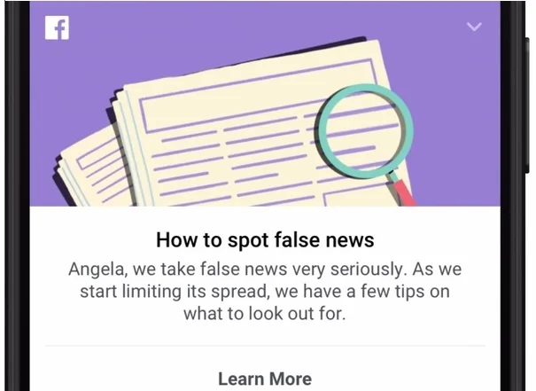
Facebook is launching a new app for spotting what the company is calling "false news and hoaxes." In a blog post titled "A New Educational Tool Against Misinformation," the company explains the new tool:

We know people want to see accurate information on Facebook – and so do we. False news and hoaxes are harmful to our community and make the world less informed. All of us have a responsibility to curb the spread of false news.

At Facebook we have been focusing on three key areas:

  • disrupting economic incentives because most false news is financially motivated;
  • building new products to curb the spread of false news; and
  • helping people make more informed decisions when they encounter false news.

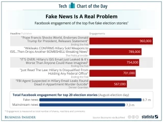
Facebook and Google has been under pressure to address the increasing number of offensive and incorrect posts on their sites. This is Facebook's latest strategy to take responsibility and address the criticism that such sites are not doing enough.

The tool offers the following advice:

1. Be skeptical of headlines. False news stories often have catchy headlines in all caps with exclamation points. If shocking claims in the headline sound unbelievable, they probably are.

2. Look closely at the URL. A phony or look-alike URL may be a warning sign of false news. Many false news sites mimic authentic news sources by making small changes to the URL. You can go to the site and compare the URL to established sources.

3. Investigate the source. Ensure that the story is written by a source that you trust with a reputation for accuracy. If the story comes from an unfamiliar organization, check their "About" section to learn more.

4. Watch for unusual formatting. Many false news sites have misspellings or awkward layouts. Read carefully if you see these signs.

5. Consider the photos. False news stories often contain manipulated images or videos. Sometimes the photo may be authentic, but taken out of context. You can search for the photo or image to verify where it came from.

6. Inspect the dates. False news stories may contain timelines that make no sense, or event dates that have been altered.

7. Check the evidence. Check the author's sources to confirm that they are accurate. Lack of evidence or reliance on unnamed experts may indicate a false news story.

8. Look at other reports. If no other news source is reporting the same story, it may indicate that the story is false. If the story is reported by multiple sources you trust, it's more likely to be true.

9. Is the story a joke? Sometimes false news stories can be hard to distinguish from humor or satire. Check whether the source is known for parody, and whether the story's details and tone suggest it may be just for fun.

10. Some stories are intentionally false. Think critically about the stories you read, and only share news that you know to be credible.

Discussion:

  • To what extent do you think this will address the concerns about fake news?
  • Which of the suggestions for spotting fake news do you find most and least helpful? Which are more obvious than others?
  • What else, if anything, should Facebook do?
Read More

Infographic Gets Panned on Twitter

Min wage infographicInvestmentZen, which encourages financial independence, created an infographic with advice for living on minimum wage, currently $7.25 per hour. Suggestions include selling your car, moving to a less expensive city, and recognizing that "a lot of the best things in life are free."

Reactions are generally not positive. Twitter users are taking offense at some of the advice, pointing out that, for example, not everyone has the flexibility to move across country. Part of the infographic identifies "excuses" for not moving, including "All of my friends and family live here." Sounds like a good reason to stay put to me, particularly for people living in poverty or close to it.

Others on the Twitter thread note the missing expenses of moving, doing laundry, and children should anyone choose to have them. An obvious logical flaw is in suggesting people sell their car, yet suggesting picking up some Uber shifts.

This reminds me (and others) of a 2013 McDonald's website with advice to employees, including getting a second job. To help employees manage expenses, the site showed a sample monthly budget with $25 for health insurance. McDonald's pulled the site and published this statement:

We have offered the McResource program to help our valued McDonald's employees with work and life guidance created by independent third party experts. A combination of factors has led us to re-evaluate, and we've directed the vendor to take down the website. Between links to irrelevant or outdated information, along with outside groups taking elements out of context, this created unwarranted scrutiny and inappropriate commentary. None of this helps our McDonald's team members. We'll continue to provide service to our folks through an internal telephone help line, which is how the majority of employees access the McResource services.

Discussion:

  • Analyze the full infographic. What visual and organizational design principles from Chapter 9 in the text are used?
  • What other logical flaws can you identify?
  • Overall, do you find the advice useful, or does it enrage you as it does some Twitter users? Should InvestmentZen pull the infographic and issue a statement as McDonald's did in 2013?
Read More

Germany Proposes to Fine Companies for Illegal Content

Hate-speechThe German government wants to fine Google, Facebook, and other social media sites if they don't remove "hate speech, fake news and other undesirable content" within 24 hours if it's considered "blatantly illegal" and within seven days if it's otherwise considered to be breaking the law.

A Politico article describes the decision:

"Facebook and Twitter missed the chance to improve their takedown practices," said Heiko Maas, federal minister for justice and consumer protection. Maas claimed social media networks don't take complaints seriously. "For companies to take on their responsibility in question of deleting criminal content, we need legal regulations."

According to one study, Facebook removed 33% of illegal posts within 24 hours so far this year-not enough for some critics-and Twitter did worse, removing only 1% within 24 hours. The social media companies argue that policing negative activity is nearly impossible given the volume of posts on their sites.

In Twitter's defense (it needs one), the company has published extensive policies, including those related to "Hateful Conduct." But bullying, threats of violence, and other misconduct have been an issue for Twitter since the beginning and continue to plague the site's credibility.

In related hate-speech news, AT&T, Johnson & Johnson, and other big companies are pulling ads on YouTube because they don't want them appearing next to inappropriate content. This is another, perhaps more effective, way to get the social media sites to take action.

Image source.

Discussion:

  • What's your view of Germany's proposed law: reasonable, necessary, unrealistic, or something else?
  • What effect do you think such a law would have on the social media sites? How about its users?
Read More

Monsanto Emails Reveal Company's Potential Influence over Cancer Studies

RoundUpA key ingredient, glyphosate, in weedkiller Roundup may cause cancer, and emails from Monsanto employees put the company's role in cancer research into question. According to a Dow Jones news report, "Emails among company employees, released this week as part of a continuing lawsuit over the herbicide, reflect what the plaintiffs' attorneys say was the company's inappropriate role in shaping research and a cozy relationship with regulators at the U.S. Environmental Protection Agency. Monsanto argued the emails were taken out of context."

An EPA toxicologist, who had cancer, concluded that "it is essentially certain that glyphosate causes cancer." She wrote an impassioned letter to EPA Deputy Division Director Jess Rowland in 2013 highlighting the negative effects of the chemical.

Perhaps the most damning evidence is a Monsanto email summarizing a phone conversation with Rowland, which implies that the EPA is trying "kill" evidence of glyphosate causing cancer:

EPA Monsanto email
In addition, Monsanto's own lead toxicologist wrote in a 2009 email and confirmed in a recent deposition, "you cannot say that Roundup does not cause cancer … we have not done carcinogenicity studies with ‘Roundup.'"

Discussion:

  • Once again, let's help companies avoid legal trouble with email. What should Monsanto have done differently?
  • Of course, email isn't to blame, but the company and EPA may be. What went wrong here?
     
Read More

Cancer Research Scientist Faces Credibility Questions

What The New York Times calls "years of ethics charges" have plagued a cancer researcher, but new problems may be his final undoing. Dr. Carlo Croce, at Ohio State University, has brought in $86 million in federal grants, but the Times reports, "he overstated his expansive claims for the therapeutic promise of his work, and that his laboratory is focused more on churning out papers than on carefully assessing its experimental data."

David A. Sanders, a virologist at Purdue University, has called out more than 20 of Croce's papers claiming falsified data: "It's a reckless disregard for the truth."

In a nifty, interactive visual, The New York Times shows how Croce's work was manipulated in one journal article. If you look closely, you see that a bright line is disjointed, warning that some copying and pasting took place. Indeed, samples 6, 7, and 8 are identical to 3, 4, and 5.

Display

Also questionable is Croce's work as an advisor to the Council for Tobacco Research. Although Croce says he believes smoking causes lung cancer, the Council has used his work to prove otherwise.

One of the biggest questions is the role of Ohio State University: did the administration dismiss charges that should have been more seriously considered? The University responded to the article in a short opinion letter, concluding, "While the review is still underway, the independent experts have found that our policies meet with national research compliance standards. They have also found no evidence that Ohio State deviated from those policies in reviewing allegations of research misconduct."

Discussion:

  • Read the NYT article. What do you believe are the most egregious claims against Croce?
  • Look online for other examples of image manipulation in scientific journals. Should  peer-review journals be more vigilant in catching these falsifications? Or are they too difficult to judge?
  • Analyze the University's opinion letter. Which parts do you find most and least convincing?
Read More

Snap in Charts

Eric Spiegel, the founder of Snap Inc., is celebrating after a successful IPO that brought in $25 per share, a market value of $33 billion, and enough to bring his net worth to $6 billion, making him wealthier than Richard Branson, Donald Trump, and Oprah.Snap chart

It's not the largest IPO, but the numbers are surprising, given that Snapchat is essentially an app, and 98% of its revenue comes from advertising. MarketWatch also reports losses:

Snap recorded $404.5 million in revenue in 2016, compared with $58.7 million in 2015. Net losses grew to $514.6 million in 2016, compared with a net loss of $372.9 million in 2015. Like many burgeoning tech startups, Snap warned that it "may never achieve or maintain profitability."

Still, the ad revenue is solid because of Snapchat's popularity with teens. As the second chart shows, Snapchat is highly popular and has seen a lot of growth between 2015 and 2016.  Snap chart 2

IPO image source and teen use image source.

Discussion:

  • What principles for chart design from Chapter 9 are demonstrated in these two examples?
  • What would you change about these charts to make them more effective?
  • What 2017 data can you find about Snapchat? Create a new comparison chart.
Read More

Gates Annual Letter

The GatMortalityes Foundation's 2017 annual letter is far from a traditional annual report. Instead, it's a letter to Warren Buffet, who, in 2006, gave much of his fortune to support the Foundation's work. 

The report starts with a 2016 letter from Buffet asking Bill and Melinda Gates to, in part, to help "people better understand why success in philanthropy is measured differently from [sic] success in business or government."

The response focuses on "the stunning gains the poorest people in the world have made over the last 25 years." Data include the number of children's lives saved, 122 million.

With quotes from Melinda and Bill, the report includes progress on fighting disease and many charts to show declines in mortality rates around the world. We see such a rich variety of chart types: bar, pie, line, area, and area. In addition, the letter includes a table, photos, videos, and a wonderful bubble chart from Gapminder.org, founded by the recently deceased data visualization pro Hans Rosling.

Discussion:

  • Analyze the Gates letter. What do you find most and least effective?
  • Analyze each chart type against principles in Chapter 9. Is each the best choice for the data displayed? Could any be replaced with a more effective type of chart?
  • How are photos and videos used strategically? What is their purpose?
  • I wrote "[sic]" within Warren Buffet's quotation. What does this mean?
Read More

NFL Rejects GNC Ad

GNCGNC, the vitamin store company, is trying to improve its image, but the company won't get a spot in this year's Super Bowl. Although Fox News accepted the ad, the NFL pulled the plug.

According to AdAge, "Jeff Hennion, exec VP-chief marketing and e-commerce officer at GNC, said the NFL objected to its commercial because fewer than 3% of its products include two of the 162 substances banned by the league. According to Mr. Hennion, the NFL has approval rights over commercials in the big game." NFL also wanted GNC to change its logo, which has the name on a pill bottle. The company was working on that, but the commercial was still rejected.

Image source.

Discussion:

  • Why do you think the NFL rejected GNC's ad? Is it about the banned substances or something else? Related question: What's your view of the ad?
  • I can't find a statement from the NFL. Should the company make a comment? What are the advantages and potential downsides?
  • GNC makes an interesting argument with the 3% claim. Do you find it convincing? Consider principles from Chapter 9.
Read More

How to Erase a CEO

Before and AfterThe Trump organization has revamped its websites to remove images of the President-Elect and his daughter, Ivanka. The New York Times shows several "before-and-after" screenshots of his company's websites. As Trump is in the midst of detaching himself from his businesses to avoid conflicts of interest, these changes seem to be mere gestures to some legal experts.

Norman Eisen, former chief White House ethics lawyer for President Obama, said, "The problem is, like all of the Trump conflict remedies, these are half-measures and Band-Aids that tape over a gaping wound. Until Mr. Trump definitively severs his ownership with these businesses, the conflicts and the myriad of controversies and risk of scandal and corruption that flow from them are going to continue unabated."

Still, the photos show dramatic differences for several Trump Towers and Trump Hotels, Trump International Realty, Trump.com, and Trump Golf.

Discussion:

  • The Times article shows several Trump family images still on his websites. Should they all be removed? Try to argue both sides of this issue.
  • Many images were removed in just the past two days, according to the Times article. Is the timing important for the imminent inauguration, or doesn't it matter?
  • How do you think removing these images from these sites will affect the family businesses, if at all?
Read More

Plagiarizing a Dissertation Puts Trump Pick in Question

President-elect Trump's choice for the senior director of strategic communications for the National Security Council is Monica Crowley, a political commentator. Politico reviewed her dissertation in international relations from Columbia University and found multiple issues of using quotations with quotation marks, paraphrasing too closely, and missing citations.

The example shown here is one of twelve Politico questioned.

Crowley Plagiarism

The Trump team is standing by their candidate: "Any attempt to discredit Monica is nothing more than a politically motivated attack that seeks to distract from the real issues facing this country." And Columbia University is trying to avoid the controversy, as a media representative told The Chronicle of Higher Ed:

"We have no comment on Monica Crowley's dissertation, which was submitted in 2000 and is publicly available. The university's process for addressing concerns raised about university research preserves the confidentiality of any review, and even the fact of a review's existence is confidential while it is underway. Columbia is committed to upholding the very highest standards of integrity and credibility in academic research."

CNN reports more than 50 instances of plagiarism in Crowley's 2012 book, What the (Bleep) Just Happened? In a statement, publisher HarperCollins said, "The book, which has reached the end of its natural sales cycle, will no longer be offered for purchase until such time as the author has the opportunity to source and revise the material."

Discussion: 

  • Review the examples presented by Politico and CNN. What principles of documenting sources described in Chapter 10 are missed?
  • Is this a big deal, or is the media overblowing the situation, as the Trump team believes? Does her potential position as the senior director of strategic communications influence your opinion?
  • What should happen now? How should Crowley and the Trump team handle her pending position?
Read More

Snap Inc. May Have Falsified Metrics

Snap IncAs Snap Inc. plans for an IPO, a former employee says he was fired for trying to reveal falsified metrics. Anthony Pompliano claims he was terminated only three weeks into his tenure at Snap Inc. running the new user growth and engagement team. Pompliano also charges Snap Inc. with hiring him from Facebook to get proprietary information.

"We've reviewed the complaint. It has no merit. It is totally made up by a disgruntled former employee," said Mary Ritti, Snap's vice president of communications. The company also said Pompliano was fired because he was "incompetent" and "not adequately performing in his position." 

Pompliano's attorney said, "Snapchat's leadership saw Mr. Pompliano as an impediment to their planned IPO because he refused to turn a blind eye to Snapchat's misrepresentations." (Snapchat is the former name of Snap Inc.) The claim also charges Snap Inc. with damaging the former employee's reputation and ability to find new work.

Business Insider posted the entire court filing, but several pages are heavily redacted, like the one shown here. These darken parts may represent proprietary Snap Inc. information.

This isn't the first time Snapchat's integrity has been questioned. In 2014, the company settled a claim with the Federal Trade Commission that it exaggerated how easily images sent through the app disappear. The news led to many doubting the safety of sending personal images.

Discussion:

  • In what ways could Snap Inc. exaggerate metrics to potential investors? What do you think is the issue here?
  • How credible do you find Pompliano's claim? How can a judge decide such a claim?
Read More
09 and 10: Data Vis and Reports Amy Newman 09 and 10: Data Vis and Reports Amy Newman

JPMorgan Slide Needs Explanation

JPMorgan CEO Jamie Dimon and others didn't understand a slide about the bank's strategy. Daniel Pinto, head of the corporate and investment bank, presented the slide to Dimon and others. According to Business Insider, Dimon said of the chart: "no one understood, including myself at the time."

JPMorgan slide

The slide is part of a longer presentation about the corporate and investment banking division. In an interview with Business Insider, Pinto explains the chart:

"This is fully loaded ROE for all the business lines in fixed income. This is what we produce. This line is the cost of capital, and every single business, on a fully loaded basis, is delivering a return ahead of the cost of capital, except for commodities, which is going through a process of adjustment. The most important part is if you were to eliminate one of those, not all of the capital goes away, not all of the cost goes away, so essentially the marginal impact, the ROE you would lose by closing the business, is far higher than 15%. That's why, for me, the completeness is very important."

Discussion:

  • To what extent does Pinto's explanation help you understand the chart?
  • Should an executive use a chart that's difficult to understand intuitively? What should you consider in making this decision? Consider the audience, setting, etc.
Read More

Facebook Gets Serious About Fake News

20161118_fake_newsFacebook is getting serious about addressing fake news on its site. The issue came to a head when an armed man fired a shot in a pizzeria, believing a story about Hillary Clinton ran a child sex ring there. 

First, Facebook is partnering with outside fact checkers ABC News, The Associated Press, FactCheck.org, Politifact, and Snopes, who will review a story identified as possibly untrue. Stories that don't pass muster will be flagged as "disputed," will show lower down on a newsfeed, and will carry another warning if people want to share it.

In a post on its website, Facebook explained the changes in text, with images from the app, and in this video.

Although Mark Zuckerberg has downplayed the issue as only 1% of Facebook posts, he clearly see the company's responsibility. He wrote a post of his own to explain how they're taking action, and the company's post ends, "It's important to us that the stories you see on Facebook are authentic and meaningful. We're excited about this progress, but we know there's more to be done. We're going to keep working on this problem for as long as it takes to get it right."

Image source.

Discussion:

  • What's your view of this approach? Will these strategies work? What else, if anything, should they do?
  • How well is Facebook communicating these changes? Review the blog post text, images, and video.
Read More
09 and 10: Data Vis and Reports Amy Newman 09 and 10: Data Vis and Reports Amy Newman

Mixed Conclusions in EPA Fracking Report

EPA3A CBS news article says the Environmental Protection Agency's latest report on fracking "raises more questions than answers." The report concludes, "EPA found scientific evidence that hydraulic fracturing activities can impact drinking water resources under some circumstances. The report identifies certain conditions under which impacts from hydraulic fracturing activities can be more frequent or severe."

However, the abstract also includes, "Data gaps and uncertainties limited EPA's ability to fully assess the potential impacts on drinking water resources locally and nationally. Because of these data gaps and uncertainties, it was not possible to fully characterize the severity of impacts, nor was it possible to calculate or estimate the national frequency of impacts on drinking water resources from activities in the hydraulic fracturing water cycle."

Although detailed conclusions may fall short, the agency is trying to make the message accessible by providing a few versions. The website provides a list of all communications related to the study. A fact sheet provides a visual of the fracking process and gives an overview of the findings and how the report can be used.

Discussion:

  • Which principles from Chapter 10 in the text does the report follow? Which are not followed?
  • How do you assess the findings? How does the report affect your thinking about fracking?
  • To what extent do you find the fact sheet useful? How does it fall short?
Read More