
Narrative Alternatives to PPT at Amazon and Google
In his annual letter, Amazon CEO Jeff Bezos wrote that he has banned PPT:
"We don’t do PowerPoint (or any other slide-oriented) presentations at Amazon. Instead, we write narratively structured six-page memos. We silently read one at the beginning of each meeting in a kind of 'study hall.'"
Nancy Duarte describes the value of a narrative or storytelling approach: "storytelling in presentations is a powerful way to grab attention, hold attention, and to change beliefs." She gives examples from our favorite books and movies, which build suspense over time. Stories are also a good way to inspire empathy and other emotional reactions. This is difficult to achieve with traditional PowerPoint bullets.
A Harvard Business Review article, "Structure Your Presentation Like a Story," provides more guidance and summarizes the approach with a graphic:

For Bezos, the narrative style means that points are connected and organized in a logical sequence with some resolution, conclusion, or outcome. GeekWire created this six-page memo in Amazon's style as an example.
At Google, CEO Sundar Pichai also emphasizes storytelling with pictures:
"Since stories are best told with pictures, bullet points and text-heavy slides are increasingly avoided at Google."
Both executives are warning against the type of communication that is overly concise and missing context, connections, and cohesiveness. A ZDNet article summarizes some of the issues with PowerPoint and describes the now-infamous role of PPT in a U.S. disaster:
"'[B]ulletized' thinking contributed to the Challenger disaster, where 7 crew members died and a multi-billion dollar craft destroyed due to an O-ring failure. The big problem was that NASA management wasn't really listening to the engineers—and breaking issues up into bullets helped them do that."
Pichai's design approach aligns with PPT trends over the past few years. We're seeing much less text, fewer bullets, and more images, and this style follows the evolution of web design. On websites, we see many more background videos and photos and not much text, particularly on consumer websites.
Discussion:
- What are the advantages and downsides to the narrative memo? For what types of situations do you think this approach would work well? For what situations might PPT be a better choice?
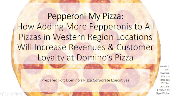
- For practice, try to convert this terrible PPT presentation to one with less text and more meaningful images. Clean up the design, add charts to help your audience visualize data, and of course, correct the grammar.

Bias in Online Courses
A Stanford University study found biases in how instructors interact with students in online courses. In a review of 124 Massive Open Online Courses (MOOCs) in a variety of subjects, researchers found that responses to comments vary by students' race and gender:
Each comment was randomly assigned a student name connoting a specific race and gender. We find that instructors are 94% more likely to respond to forum posts by White male students. In contrast, we do not find general evidence of biases in student responses. However, we do find that comments placed by White females are more likely to receive a response from White female peers.
The study is significant because it identifies teachers' potential responsibility for different student learning outcomes. In other words, it's difficult to isolate why teachers respond differently to students because the students may, for example, be less prepared or have less ability. But in this study, the issue is clearly isolated: teachers tend to favor students based on race and gender, which were randomly assigned by way of fictitious names.
Discussion:
- How well do these results match your own experience as a student?
- What are the implications of this study for instructors?
- What potential flaws or issues do you identify with this study?

Is Blankfein Leaving Goldman?

It's big news on Wall Street: the 12-year CEO of Goldman Sachs is leaving the company. But Lloyd Blankfein and other Goldman executives say they were surprised to read the Wall Street Journal report.
CNBC's Jim Cramer said the news made sense because Goldman has two co-presidents who are vying for the position: "Blankfein is deeply committed to letting a newer generation" lead.
Blankfein tackled some tough times at the investment bank. The firm managed well through the Great Recession despite criticism for misleading customers, for which Goldman paid $550 million to the SEC as a settlement. In 2009, Blankfein faced criticism when he, perhaps jokingly, told a reporter Goldman was "just doing God's work." He was positioning the firm as having a "social purpose." Finally, in 2012, a Goldman executive wrote a scathing report about the company in a New York Times opinion piece, "Why I Am Leaving Goldman Sachs."
For now, we don't know how true the WSJ report is.
Discussion:
- The Wall Street Journal report is very clear, although it doesn't identify sources, but that is typical. How do news reports like this happen? Who is responsible if it is a mistake?
- How well did Blankfein handle the situation? What, if anything, should Goldman communicate as a company at this point?

Facebook Under Fire for Russian Interference

Facebook is facing more criticism following detailed reports of how the Russian government infiltrated U.S. social media platforms during the 2016 election. The report cites Facebook as the target for Russian bots far more than any other social media site.
Since the Florida school shooting last week, we see evidence of Russian bots weighing in on gun control. Experts say these efforts are to divide the American people on political issues and are "casting public doubt on institutions such as the police or the media."
Facebook is taking action, but it's been slow, and experts wonder how much the company can do at this point. A Wired article details Facebook's journey to accountability, with much time spent in denial. Now, Facebook promises to verify accounts for election ads, but critics say it won't be enough.
In a report, Facebookers point to inherent problems with the platform:
“The central problem of disinformation corrupting American political culture is not Russian spies or a particular social media platform,” they write. “The central problem is that the entire industry is built to leverage sophisticated technology to aggregate user attention and sell advertising.
“There is an alignment of interests between advertisers and the platforms. And disinformation operators are typically indistinguishable from any other advertiser. Any viable policy solutions must start here.”
Discussion:
- What's your view of the situation and Facebook's responsibility. Is the company doing enough?
- How could Facebook re-envision its platform to avoid the problem of infiltrators on the site?
- Read the report, Digital Deceit. What business communication principles are followed, and how could the report be improved?

Adam Rippon Demonstrates Authenticity and Questions Pence
U.S. Olympic figure skater Adam Rippon has been public about being gay and having a history of an eating disorder. Rippon says he felt pressure to fit a particularly body image and sometimes starved himself to achieve it.
In January, Rippon said he would refuse a meeting with Vice President Mike Pence because of his support of "conversion" therapies, attempts to change someone's sexual orientation or gender identity. Pence denied the claim and expressed support for all athletes:
“The accusation is totally false with no basis in fact," Alyssa Farah, Pence's press secretary, stated. "But despite these misinformed claims, the Vice President will be enthusiastically supporting all the U.S. athletes competing next month in Pyeongchang.”
However, an NBC article identifies a message on Pence's website that supports Rippon's claim:
Under the headline "Strengthening the American Family" and just below his stated opposition to same-sex marriage and anti-discrimination laws protecting "homosexuals," Pence's platform advocates that resources "be directed toward those institutions which provide assistance to those seeking to change their sexual behavior."
Discussion:
- What's your view of Rippon's statement?
- Explain VP Pence's statement given his documented platform? How do you reconcile the claims?
- In what ways does Rippon demonstrate authenticity?

Missed Opportunity for a Graphic
A Business Insider article compares state income tax rates in a list of pictures and data points. The beginning of the article conveys the main point: how much you pay depends on where you live. As you might expect, rates are highest in California.
The site offers the list of city photographs and numbers on one page or as a sequence of slides. Both versions emphasize pretty pictures but make it difficult to compare data from different states.

Also, the range for each state is so broad that the information makes meaningful comparisons difficult.
Discussion:
- Should pictures get most of the attention? Why or why not?
- What are better ways for Business Insider to represent this information graphically?

Misleading Headlines About the Market Dip
The stock market took a dive this week, but headlines are making it sound worse than it is. Here are three examples:
- FoxNews: "Investors hope for reversal after biggest stock market dip of all time"
- The Guardian: "Australian and Asian stock markets slide after Dow suffers biggest one-day points fall – as it happened"
- CNBC: "Dow's nearly 1,600-point plunge marks its biggest one-day point drop ever"
The headlines are technically correct that a nearly 1,600 point decline is the largest in U.S. history, but looking at only the point value is misleading. A percentage drop would be a better indication of the effect. This table represents the largest daily stock market losses. The display below is sorted by point loss; the table at right is sorted by percentage. You can see that 2018-02-05 falls in rank when we look at the percentage.

Also, the stock market has had incredible gains this past year, so the 26,000+ value could be viewed as an anomaly, and most analysts didn't believe those gains were sustainable.
Discussion:
- What are the ethical considerations for news agencies publishing these headlines?
- What might be a more appropriate headline for the news?

Perhaps this one-year chart helps keep the loss in perspective. It includes today's rebound of 567 points.


Critics Say Bank of America Fees Hurt People with Less Income

Customers want Bank of America to stop charging fees for accounts with low balances. The company ended its free checking account and will start charging $12 per month.
Critics say the decision disproportionately hurts low-income consumers. The president of a financial advocacy organization explains the consequences:
“The debate over Bank of America’s accounts and fees points to a larger economic justice issue — people with less income pay more to get cash, make payments, and conduct their business. Without access to safe and affordable bank accounts, low-income consumers often turn to costly alternative financial services, such as currency exchanges or check-cashers. The bottom line is: the most financially vulnerable need more and better options to transact their business and participate in the financial mainstream.”
Few big banks still have free checking options because they are expensive to maintain. Banks prefer to move customers to digital solutions. But many low-income people don't have smartphones or reliable internet access. More than 287,000 people have signed a Change.org petition.
Discussion:
- What's your view? Is Bank of America being unfair, or is this just a good business decision?
- What is the value of a petition? On what principles of persuasion does a petition rely?
- How well does the image on the petition site, shown here, work? The emotional appeal is obvious. Does it help or detract from the message?

Controversy About Apple's "What's a Computer?" Ad
Apple's upbeat "What's a Computer?" commercial isn't winning a lot of fans. The long version on YouTube shows a child using an iPad to video chat with a friend, send a picture, type a paper, take a picture, pay for food, draw, and read a comic book. When asked by a woman we assume is the mother, "What you doing on your computer?," the child responds, "What's a computer?"

Cute? Many people think not. According to a Business Insider article, some find the ad "infuriating."
Discussion:
- What did Apple hope to accomplish with this ad? To what extent did the company achieve its purpose?
- We might say this is a lesson in humility for Apple. How do you see it?
- Why do you think people are so angry about it?

Fudging Numbers to Make the NYC Subway Look Better

New York Governor Andrew Cuomo's staff is criticized for inflating power-related issues as the cause of subway failures. Transit officials apparently broadened the definition of power issues so that Con Edison, the local utility company, would be given more of the blame when subways aren't running. Emails were discovered before Governor Cuomo was scheduled to give a breakfast talk, during which he said the number of outages due to power failures was 32,000 in the past year, while the actual number was more like 8,000:
When you we're a kid and you had a train set you had to plug it in. We have to plug in the MTA every morning and the MTA does not control the power supply to the MTA. Over the last 12 months, 32,000 delays because of power related issues and they can either be a power surge or power shortage, but 32,000 delays. The MTA doesn't control the power, Con Edison does. Con Edison has a duty to safely, prudently and effectively provide electricity that powers the subway system. Con Ed is a regulated utility under the state's Public Service Commission. April 21 after the last outage I ordered an investigation of the Con Ed infrastructure after a particularly devastating failure. The investigation goes on but PSC has already found that Con Ed must make immediate and significant improvements in this system because the reliability depends on it.
The chief of staff of the transit agency wrote in an email that they were "looking for a higher delay number for power." The expanded definition was that ConEd "caused or contributed to" delays. One example is when a person jumps or falls onto the tracks; ConEd will shut off the power for safety. With the new definition, the delay becomes ConEd's fault.
Discussion:
- We certainly can use numbers to our advantage when trying to persuade others. How does this situation "cross a line"?
- What should Governor Cuomo do now? What, if any, statement would be appropriate?
- Do you remember "Bridegate" in New Jersey? How is this situation similar or different?

How Well Can People Rate News "Credibility"?
Facebook has a solution to its fake-news problem: allow users to assess stories' credibility and trustworthiness. Stories rated more highly will get higher ranks in newsfeeds.

In a Facebook post, Mark Zuckerberg explained the plan:
Here's how this will work. As part of our ongoing quality surveys, we will now ask people whether they're familiar with a news source and, if so, whether they trust that source. The idea is that some news organizations are only trusted by their readers or watchers, and others are broadly trusted across society even by those who don't follow them directly. (We eliminate from the sample those who aren't familiar with a source, so the output is a ratio of those who trust the source to those who are familiar with it.)
Critics call the move "time-wasting stupidity":
So people get to rate the credibility of news. Based on what?
The answer is easy. People will believe any story that presents a view they want to hear.
Is there a point to this?
Sure, Facebook wants people to waste still more time on Facebook debating what is or isn't fake new [sic].
Rating news stores based on credibility is time-wasting silliness.
That's precisely why Facebook introduced the feature. Don't fall for it.
Discussion:
- Business communicators may have some questions as well. What principles of research and source credibility are in question here? What do we know about how people interact on social media that may jeopardize Facebook's plan?
- On the other hand, what is positive about the plan?
- On balance, are you more optimistic or pessimistic about Facebook's ability to reduce fake news?
- Assess Zuckerberg's writing skills in the full post. How well does he organize the message and communicate his ideas?
- Is this a good or a weak example of Facebook's accountability?
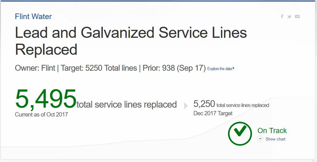
More Water Issues for Flint and No Response
Flint, Michigan, is in the news again for poor water quality. After findings of too much lead in drinking water, the city was under an agreement to replace faulty pipes, provide water filters, and report on progress. However, advocacy groups say the city is already falling short of the terms set in March of this year. According to the NPR article, "City and state officials did not immediately respond to the allegations."
Although some water service lines have been replaced, the number is not keeping pace with the agreement. Critics say that "all of the City's status reports have been late, incomplete, inaccurate, or a combination thereof."
The government has its own messaging on a website from the mayor's office. According to the data and chart, the city is "on track."
Discussion:
- Read the criticism and the mayor's report. What are the discrepancies, and how do you account for them?
- What else, if anything, should the city do to communicate its progress and demonstrate accountability?
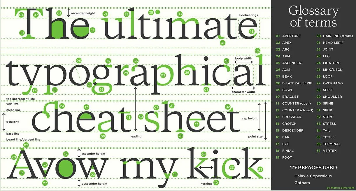
More Than You Want to Know About Fonts
 This may be more than mere mortals and business writers need to know, but typography is interesting. We often use default fonts that Microsoft chooses for us, but this graphic shows the many variables among them.
The most commonly known term is probably serif, shown here as 28 on the third row. The letter h in this font has small lines at the bottom. These "legs" are missing in sans-serif fonts, which means they are "without" them. Serif fonts include Times New Roman, Garamond, and Georgia (this one), while standard sans-serif fonts are Arial and Calibri.
Fonts can reflect a company or style of writing. Disney and others have their own special fonts, which could be fun for headings but may be too much for body text. People are long tired of Comic Sans, which is cute for K-12 documents but little else. Serif fonts tend to be more formal looking, while sans-serif are more informal.
Although presenters get creative in choosing fonts, a common problem is using a font that isn't installed on another computer. For example, you create a PPT file on one computer, but when you open the file on another and the font isn't available, the new computer will choose a default. This messes up alignment because the two fonts may be different sizes. More specifically, from the glossary at right, the character width, ascender height, or x-height may be different.
Some fonts are wholly unreadable and should be avoided entirely. Impact, for example, should be used sparingly for large headings only.
Discussion:
- Do you have a favorite font? What do you like about it?
- Have you tried different fonts for different purposes? How did it turn out?

More Criticism for Starbucks' Coffee Cup
 Starbucks' coffee cup isn't spared another year of criticism. In 2015, Donald Trump, before he was president, said the company participated in a "War on Christmas" because its cup was a solid red color with no Christmas symbols.
This year, the company is accused of having a "gay agenda." At one point during the promotional video, two women have their hands on a cup and are looking at each other. A company spokesperson said, "This year's hand-drawn cup features scenes of celebrating with loved ones-whoever they may be. We intentionally designed the cup so our customers can interpret it in their own way, adding their own color and illustrations."
A compilation of Starbucks Christmas coffee cups shows an interesting history. The first holiday cups, in 1997, were in four colors, none of which were red. Also, although this year's cup is identified as "not red," many of the drawings are red.
Starbucks is no stranger to controversy. During the political firestorm earlier this year, CEO Howard Schultz promised to hire 10,000 refugees by 2022.
Discussion:
- How do you interpret the coffee cup? What does it mean to you? Do you think Starbucks is trying to promote a "gay agenda"?
- This may be another example of "brand activism." Should Starbucks stay out of the fray or take a stand on some issues? What are the advantages and downsides of each approach?
Comparing Data About Drug Overdoses
 We can talk about the opioid crisis and try to persuade people in many ways: by telling stories, showing pictures, or presenting data. The number of deaths from all drug overdoses in 2016 is 64,070, but without more context or comparisons, it's hard to know what this number means. Is it a lot?
One important data point for context is the U.S. population, which is about 324 million. Still, does this convince you this is a "crisis," as the media calls it? 
One convincing approach is to compare the number of deaths. When we compare the figure to deaths from car accidents, AIDS, and the Vietnam War, we see that, indeed, the deaths from drug overdoses are significant-at least compared to other death tolls we consider significant.
Here's an example of a simple bar chart to represent these numbers visually.
Image source (pills).
Discussion:
- What other comparisons could work well to convince an audience that drug addiction is a serious issue?
- A different approach is to personalize the crisis. I heard an interview with someone who almost died from an overdose, and he said that, about every six months, someone he knows dies from an overdose of opioids. How compelling do you find this report? What are the potential downsides of using this type of description?
Pizza Hut and Papa John's Jump into NFL Controversy

Should CEOs get involved in political controversies? While some applaud "brand activism," others criticize business leaders who don't agree with their views.
Papa John's CEO has been vocal about the business impact of NFL players not standing during the national anthem. When explaining same-store sales, John Schnatter blamed NFL leadership:
"We are totally disappointed that the NFL and its leadership did not resolve the ongoing situation to the satisfaction of all parties long ago. This should have been nipped in the bud a year and a half ago."
Schnatter also said, "Leadership starts at the top, and this is an example of poor leadership." Schnatter contributed $1,000 to President Trump's election campaign and is aligned with the president's views on the subject. He blamed the "polarizing" actions of team members for causing declining viewership and fewer pizza orders.
But others say NFL viewership was declining long before this political controversy, and Pizza Hut jumped into the conversation. Greg Creed, CEO of Yum! Brands, Pizza Hut's parent company, said the NFL hasn't affected its sales at all.
Daniel Roberts tweeted stock comparisons on Yahoo to show that Papa John's (in red) has been declining for some time. Yum Brands is in blue. But we should be careful about comparing "apples and oranges" here.

Discussion:
- How is the stock comparison flawed? (Hint: What companies are compared?)
- What do you think of Papa John's CEO's statements? Should he stay out of it, or is he right to express his views?
- How is this story an issue of leader integrity?
Some Good News, But a Terrible Graphic
 George Soros has given $18 billion to The Open Society Foundations, his grant-giving organizations. A spokesperson for the group said the transfer "reflects an ongoing process of asset transfer that has been underway for several years." She also said that Soros, "plans to leave the vast majority of his wealth to the Open Society foundations." His fortune is estimated at more than $26 billion.
The 87-year-old Hungarian has been criticized for aiding refugees and influencing local politics. On the website, The Open Society Foundations identify the mission and vision, including this first statement:
The Open Society Foundations work to build vibrant and tolerant societies whose governments are accountable and open to the participation of all people.
The website also shows this graphic for expenditures.

Discussion:
- Should the organization say more about the money transfer? I don't see a statement on the website. Why do you think the spokesperson didn't provide a more extensive statement?
- I say the chart is "terrible." Do you agree? Why or why not? Which principles of visual communication are followed, and which are lacking?

Comms About Hurricane Harvey
 As Texas prepares for Hurricane Harvey, government officials and news organizations are preparing communications to help:
- President Trump issued a statement about monitoring the storm and encouraging people to evacuate if they are in the Hurricane's path. The president is also tweeting about the storm.
- His statement points to Ready.gov, a website rich with resources for preparing families in case of flooding, hurricanes, or extreme heat.
- CNN's website shows live updates of the storm's path.
- The National Hurricane Center is posting coastal warnings and a visual of the cone.
- Texas Governor Greg Abbott was interviewed by BBC and is hosting a meeting to plan emergency operations. (His website includes a tweet but nothing else yet about the storm.)
And, of course, the media is covering the storm with bold headlines:
- "Major disaster" (BBC)
- "Monster storm" (Washington Post)
- "Could be much worse than Sandy" (NY Post)
Discussion:
- Explore Ready.gov. What do you notice about the key messages, organization, and use of visuals? How easy is it to find information?
- Ready.gov, as of now, doesn't feature Hurricane Harvey; it's generic. Should the site be updated to feature the storm? Why or why not?
- Also explore Governor Abbott's website. Does this site feature the hurricane yet? How do you think the hurricane should be positioned here?

Is Poland Spring Water from Poland Spring?

A consumer lawsuit accuses Pepsi of falsely promoting Poland Spring Water. The product is marketed as "100% Poland Spring water," but the plaintiff group of 11 say it's really ground water. The company is accused of false advertising and misleading customers, and the plaintiffs seek $50 million in damages.
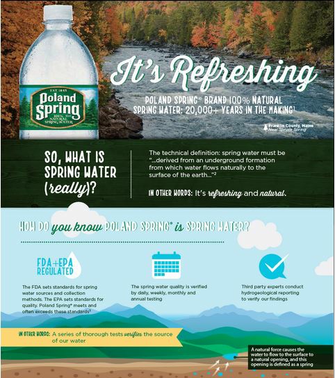
According to the Food and Drug Administration (FDA), spring water has a specific definition: "Spring water shall be collected only at the spring or through a bore hole tapping the underground formation feeding the spring. There shall be a natural force causing the water to flow to the surface through a natural orifice." Although a Poland Spring did exist in Maine, according to the suit, it dried up almost 50 years ago.
The accusations are an issue of behavioral integrity, as my colleague Tony Simons defines it: doing what you say you will do. In other words, does Nestle Water promise something it doesn't deliver?
Nestle Waters denies the claims. In response to the suit, the company created an extensive web page with a brief statement, two videos, and an infographic. The statement reads as follows:
For more than 170 years, Poland Spring® has delivered great tasting spring water from Maine to millions of people in the Northeast. The claims made in the lawsuit are without merit and an obvious attempt to manipulate the legal system for personal gain. Poland Spring® is 100% spring water. It meets the U.S. Food and Drug Administration regulations defining spring water, all state regulations governing spring classification for standards of identity, as well as all federal and state regulations governing spring water collection, good manufacturing practices, product quality and labeling. We remain highly confident in our legal position.
They are taking a strong approach to counter the claims, and they accuse the plaintiffs of seeking personal gain. One of the videos, only 30 seconds, demonstrates principles of persuasion: emotional appeal, logical argument, and credibility.
Discussion:
What elements of persuasion (pathos, logos, ethos) do you find in the video example? What other communication strategies does Nestle Water use on its web page?
Analyze the full infographic from this page. What communication design principles does the infographic illustrate? How could it be improved?
Given what little we know so far about the case, what's your view? Do you side more with the plaintiffs or with Nestle Water?

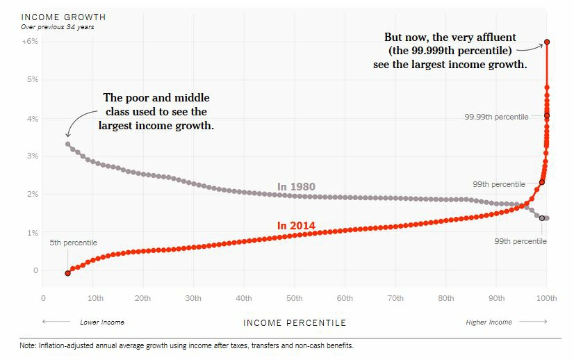
Line Chart Example
A New York Times article and corresponding charts show how income inequality has increased. In 1980, low- and middle-income people saw healthy increases in income growth. In 2014, those in the lower income percentiles saw the least growth, while the highest income earners saw the most growth.
The chart is different from a traditional line chart, which shows change over time. Each line, in this example, represents one year, and the X axis represents income level. It's effective because we see the dramatic difference between the two sample years, with a notable intersection around the 95th percentile and then a steep curve up for the very wealthy.
The Times, of course, tends to be a liberal paper, and the message is clearly anti-Trump's tax policies, but the chart illustrates the point well.
Additional charts show changes over time, and the Times calls this piece "interactive." The lines move, but "interactive" may be an overstatement.
Discussion:
- What main points do you take away from the chart?
- What's missing from the chart? How might Republicans who promote tax breaks for the wealthy argue with the representation?
- What other visuals could be useful to illustrate the points?
- How could you make the charts more interactive?